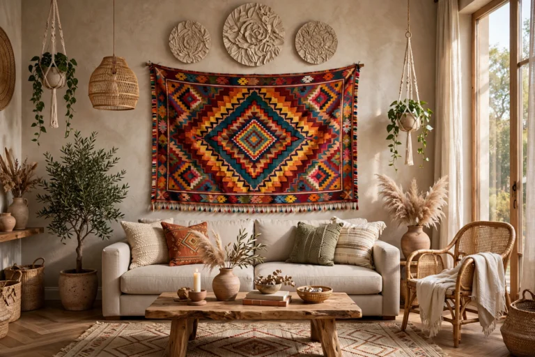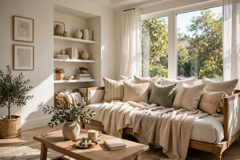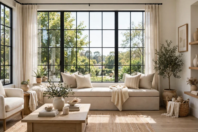

Blank living room walls are a missed opportunity. The right living room wallpaper ideas can turn an ordinary room into a space with real atmosphere — a dramatic backdrop that makes your sofa, art, and lighting look twice as good. Whether you love oversized botanicals, moody geometrics, or a full-wall photo mural, wallpaper delivers color, pattern, and texture in a way paint alone never can.
Before you order a single roll, it helps to understand the basics: pattern scale, repeat, and whether peel-and-stick or traditional pasted paper suits your home. Wallpaper has dressed up interiors for centuries — its history stretches back to hand-blocked European papers and even full-wall scenic panoramas. Below are fifteen ideas covering every style and budget, plus the practical tips that keep the finished result looking professionally done.
1. Start With One Statement Accent Wall
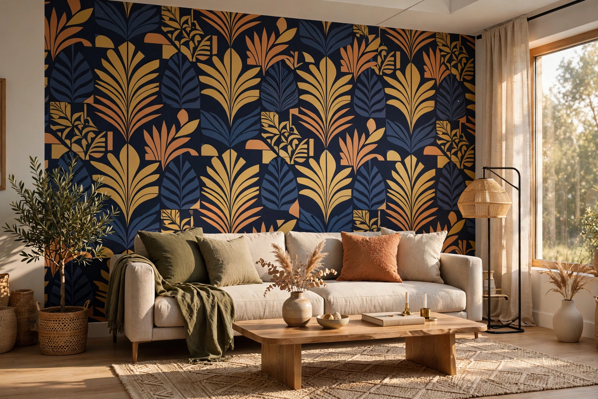
When in doubt, wallpaper a single wall. One statement wall behind the sofa or fireplace gives you all the drama of pattern with a fraction of the cost and commitment — and it naturally becomes the room’s focal point. Choose the wall your eye lands on when you enter the room, then keep the other walls a quiet solid pulled from the paper’s palette so the pattern gets all the attention.
This is also the smartest way to test a bold design. If the pattern feels too loud after a month, you have only invested in one wall. These living room accent wall ideas with big impact pair beautifully with paper: think layered art, wall sconces, and a console styled against the pattern. A single wallpapered wall also photographs better, because the camera always has one clear hero.
2. Go Bold With a Full-Size Mural Wall
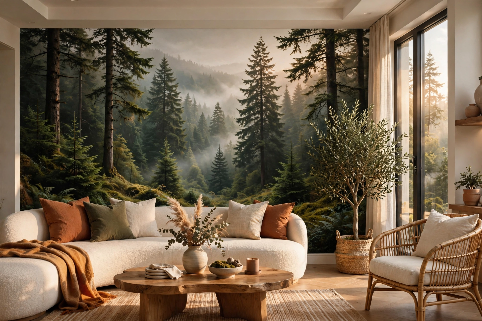
A mural is wallpaper’s blockbuster move: one seamless image — a misty forest, a city skyline, a hand-painted chinoiserie scene — scaled to your exact wall. Unlike repeating patterns, murals have no motif breaking the illusion every few feet, which makes them feel custom and gallery-worthy. Digital printing means you can order a mural sized to the inch, so measure carefully and order a little extra for trimming around outlets and corners.
Murals work best on the wall with the least furniture against it, so the image reads uninterrupted. Keep the palette of your sofa and rug quieter than the mural, or echo one accent color from the scene in your cushions to tie everything together. Good lighting matters here too — a dim mural wall looks muddy, so make sure lamps or daylight actually reach it.
3. Try Oversized Botanical Prints
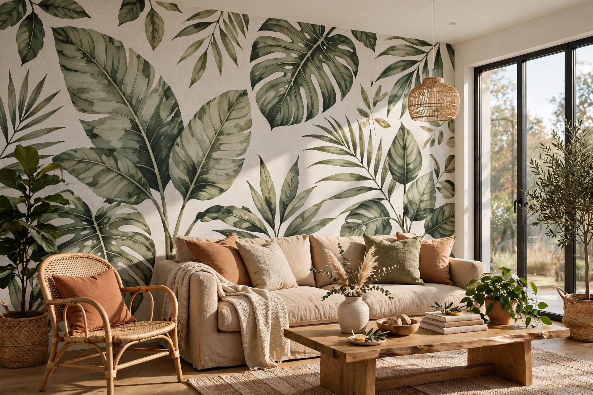
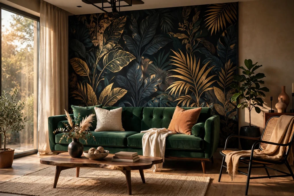
Big leaves, climbing vines, and painterly florals are the fastest way to add life to a living room without keeping anything alive. Oversized botanicals read modern rather than old-fashioned, especially in two-tone colorways like deep green on cream or charcoal on blush. The large scale means fewer repeats across the wall, which keeps the pattern feeling calm instead of busy.
Botanicals are forgiving for beginners: leaves and stems disguise slight misalignments at the seams far better than strict geometrics do. Pair a botanical wall with natural textures — rattan, linen, warm wood — to double down on the organic feel. If your room is small, choose a design with breathing room between motifs and a light background so the wall feels airy rather than closing in.
4. Add Depth With Grasscloth Texture
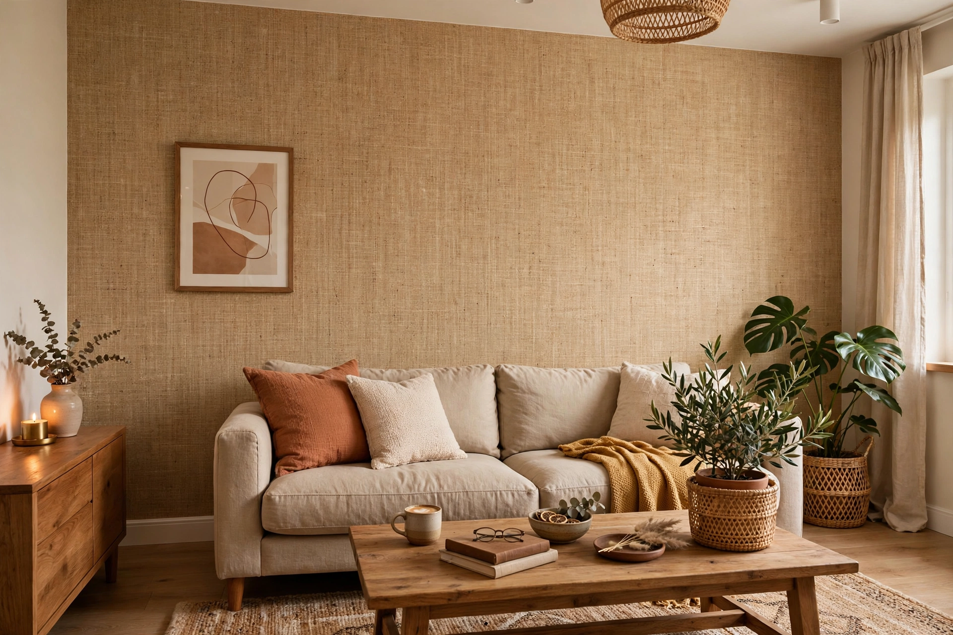
Not every dramatic backdrop needs a pattern. Grasscloth and other natural-fiber wallpapers add woven texture that catches light and shadow, giving flat walls a rich, tactile depth. In a neutral tone — sisal, jute, or pale linen — grasscloth makes a living room feel layered and expensive without shouting for attention.
Texture is a designer’s secret for rooms that feel finished both in photos and in person. Because grasscloth has no pattern repeat, you also skip the fussiest part of hanging wallpaper: there are no motifs to match at the seams. One caveat is that natural fibers show every bump underneath, so preparation matters — fill, sand, and prime the wall first. The result rewards the effort with a backdrop that works with any furniture style, from mid-century to coastal.
5. Choose Peel-and-Stick for Renter-Friendly Drama
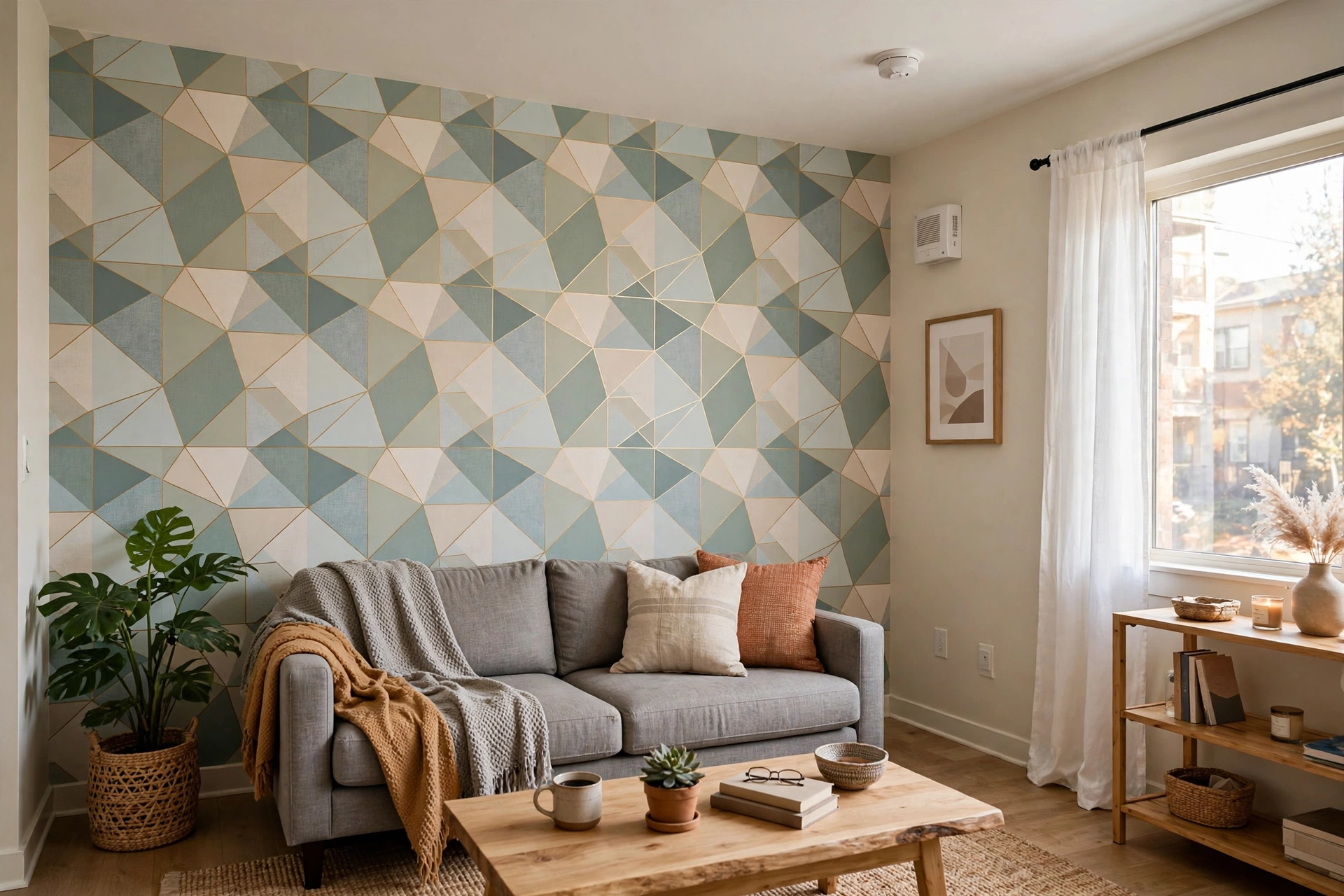
Renters do not have to sit out the wallpaper trend. Peel-and-stick wallpaper applies like a giant sticker — no paste, no water, no steamer — and removes cleanly when your lease ends. Modern adhesive papers come in genuinely beautiful designs now, from bold geometrics to convincing grasscloth looks, and the quality has improved enormously in recent years.
The trick to a professional result is patience: work panel by panel, smoothing from the center outward with a plastic smoother to push out air bubbles. If a strip goes on crooked, peel it back and reposition it — that is the whole point of the format. Start on the least visible wall to practice your technique, then tackle the feature wall. Always test a hidden spot first and remove slowly with gentle heat for the cleanest release and your full deposit back.
6. Match the Pattern Scale to Your Room Size
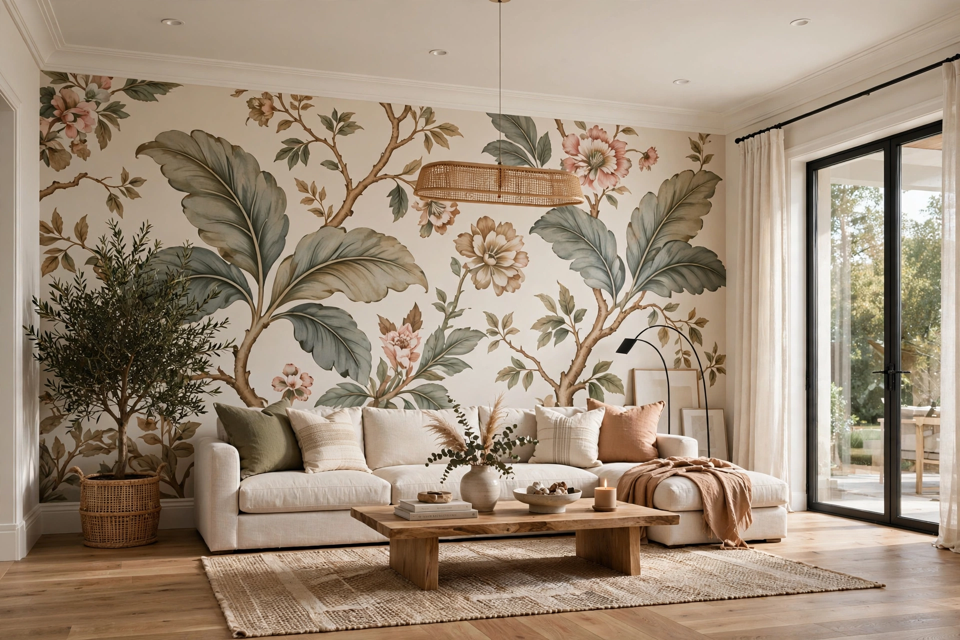
Scale is where most wallpaper choices go wrong. A tiny ditsy print in a grand living room simply disappears, while a giant motif in a snug room overwhelms everything in it. As a rule of thumb, let your ceiling height and wall width guide you: rooms with high ceilings and long walls can carry large-scale repeats, while compact rooms suit medium motifs with generous background space between them.
Check the pattern repeat size on the roll before you buy — the repeat is the distance before the design starts over, and big repeats mean more wasted paper when matching motifs at every seam. Order ten to fifteen percent extra to cover matching and mistakes. When in doubt, tape up large samples and live with them for a few days; seeing them in morning and evening light tells you far more than any product photo ever will.
7. Let Lighting Bring the Wallpaper to Life
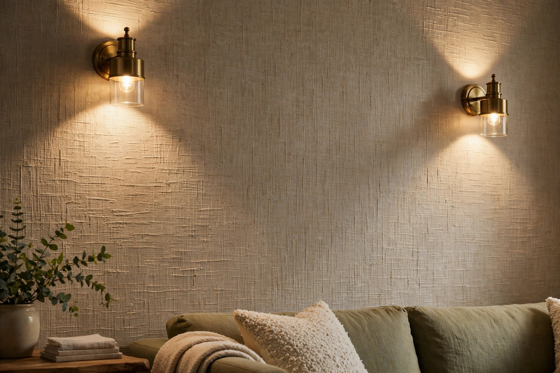
Wallpaper and lighting are partners: the same paper can look flat under a single harsh ceiling light and spectacular under layered lighting. Position picture lights, sconces, or directional spots so they graze across the paper, and watch texture and metallic details wake up. This grazing effect is especially magical on grasscloth, embossed, and flocked designs.
Avoid placing bold paper on the wall directly opposite a bright window if the pattern is dark — backlighting flattens it. Instead, put dramatic paper where lamps or daylight rake across its surface. If you are shopping for inspiration, browsing Graham & Brown’s living room wallpaper range shows how dozens of patterns sit side by side, which makes comparing scale and color far easier. Dimmers are your friend here: wallpapered rooms look best when you can tune the mood from bright daytime to evening glow.
8. Frame Wallpaper Panels With Molding
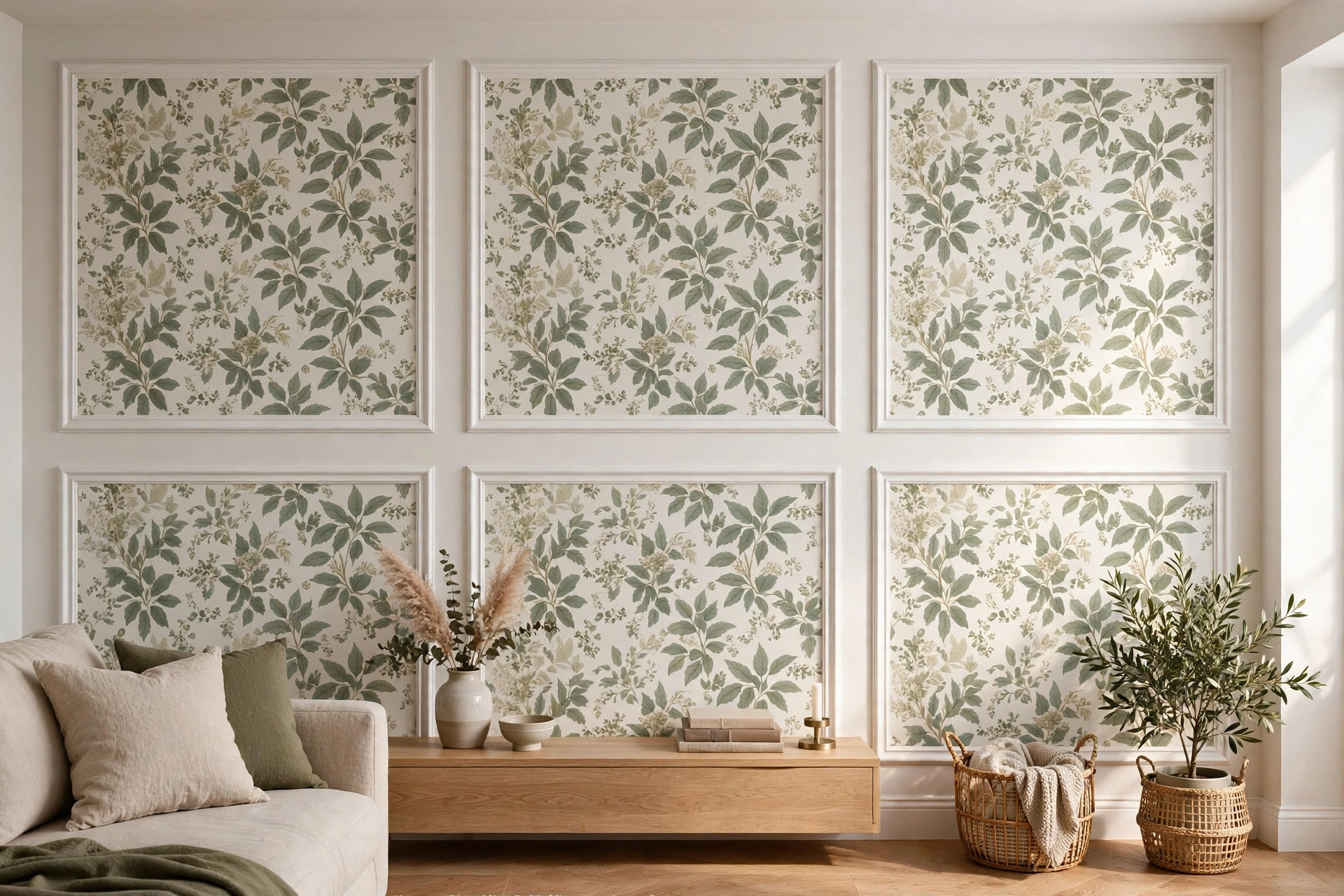
Wall molding plus wallpaper is a classic pairing that looks expensive for surprisingly little money. Apply picture-frame molding or panel molding to the wall first, then fill the frames with wallpaper — or wallpaper the whole wall and lay the molding over it. Either way, you get the tailored, paneled look of a Parisian apartment.
This technique also solves the too-much-pattern problem: molding breaks a bold design into digestible framed moments. Paint the molding the same color as your trim for a seamless built-in feel, or contrast it for graphic punch. For molding profiles, placement heights, and paint pairings, these living room wall molding ideas for elegant walls walk through the options step by step. Keep the wallpaper inside the frames a touch simpler than the room’s other textiles so the panels read as art, not noise.
9. Take the Pattern Onto the Ceiling
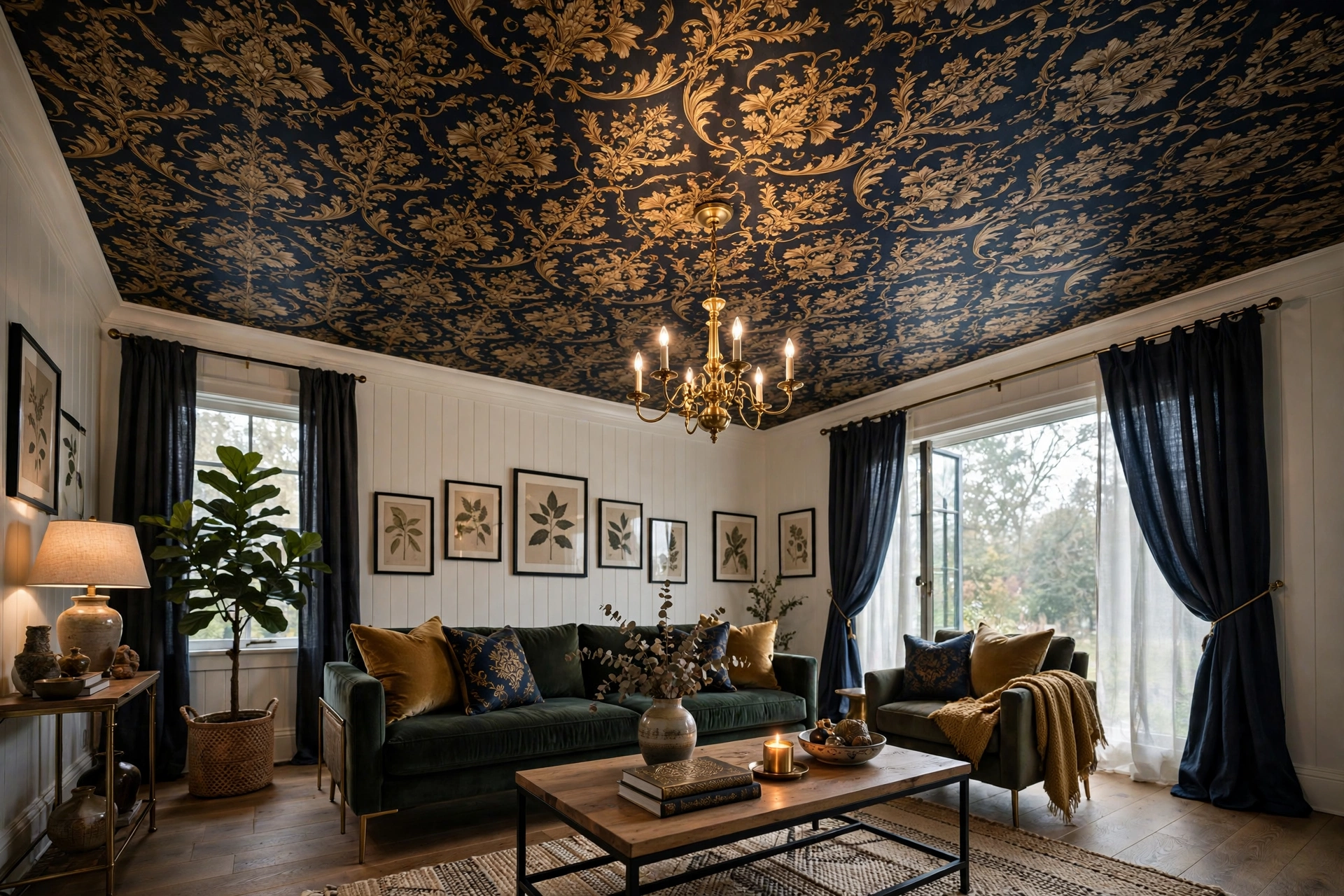
The fifth wall is the boldest canvas in the room. Wallpapering the ceiling — in a soft pattern, a starry-night mural, or even the same paper as the walls for a cocooning jewel-box effect — creates a living room guests never forget. Ceilings receive even, shadowless light, so patterns read cleanly up there.
This works best in rooms with simple furniture, since the ceiling becomes the star of the show. A small-scale pattern in a pale colorway keeps the ceiling from feeling lower, while a dramatic dark ceiling pairs beautifully with tall bookcases and moody lighting. It is a bigger job — you will want a helper and a sturdy platform — but the payoff is a room that feels designed from every angle. If the idea feels daring, test the technique on a smaller ceiling first, like a hallway or powder room.
10. Use Dark, Moody Colors for Instant Atmosphere
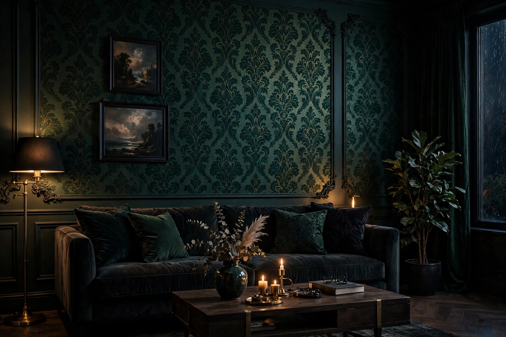
Deep emerald, inky navy, charcoal, and oxblood wallpapers create instant evening atmosphere — the kind of living room that makes everyone want to sink into the sofa and stay awhile. Dark papers recede visually, which paradoxically makes walls feel farther away, and they make brass, wood tones, and warm lighting glow by contrast.
Commit to the mood fully: paint the trim and ceiling in a coordinating deep tone rather than stark white, which can look choppy against dark paper. Then layer in warm light — table lamps, candles, a flickering fireplace glow — because dark walls need light sources to feel cozy rather than cave-like. If a full dark room feels risky, try it on the chimney breast or the wall behind the television first; a little mood goes a long way.
11. Layer Pattern on Pattern Like a Designer
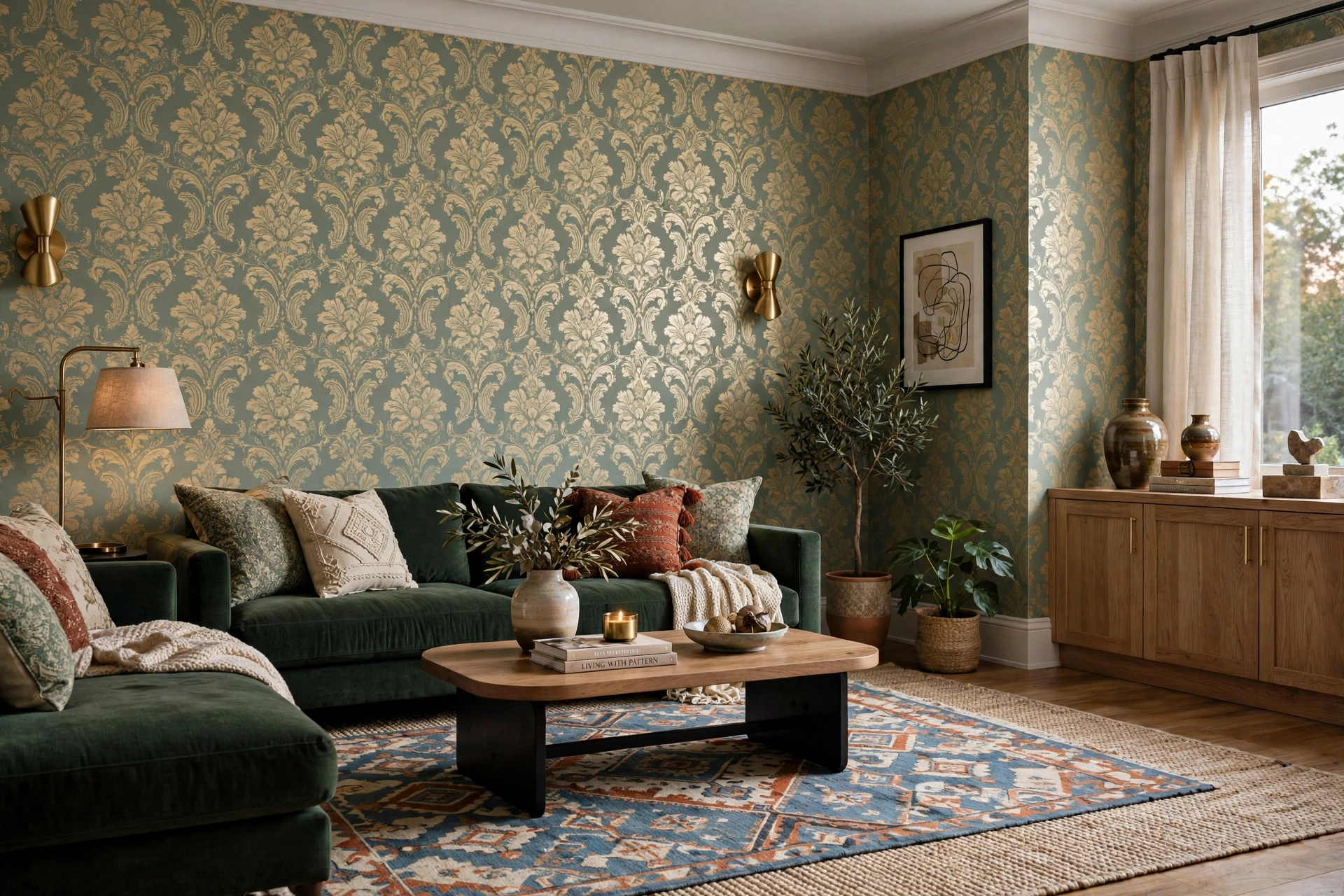
Designers mix wallpaper with patterned rugs, curtains, and upholstery all the time — the secret is varying the scale. Pair a large-scale wallpaper with a small-scale textile, or an organic floral paper with a strict geometric rug, so the patterns converse instead of compete. Keep everything inside a shared color palette and the mix feels intentional rather than chaotic.
Start with two patterns and one solid before adding a third. The sixty-thirty-ten rule helps: sixty percent dominant neutral across walls or large furniture, thirty percent secondary pattern, ten percent accent. If you are nervous, practice on a mood board — physical samples of paper, fabric, and paint chips taped to a board reveal clashes instantly. Bold mixing is a skill, and every confident maximalist room you admire started with someone brave enough to try.
12. Back Bookshelves and Alcoves With Wallpaper
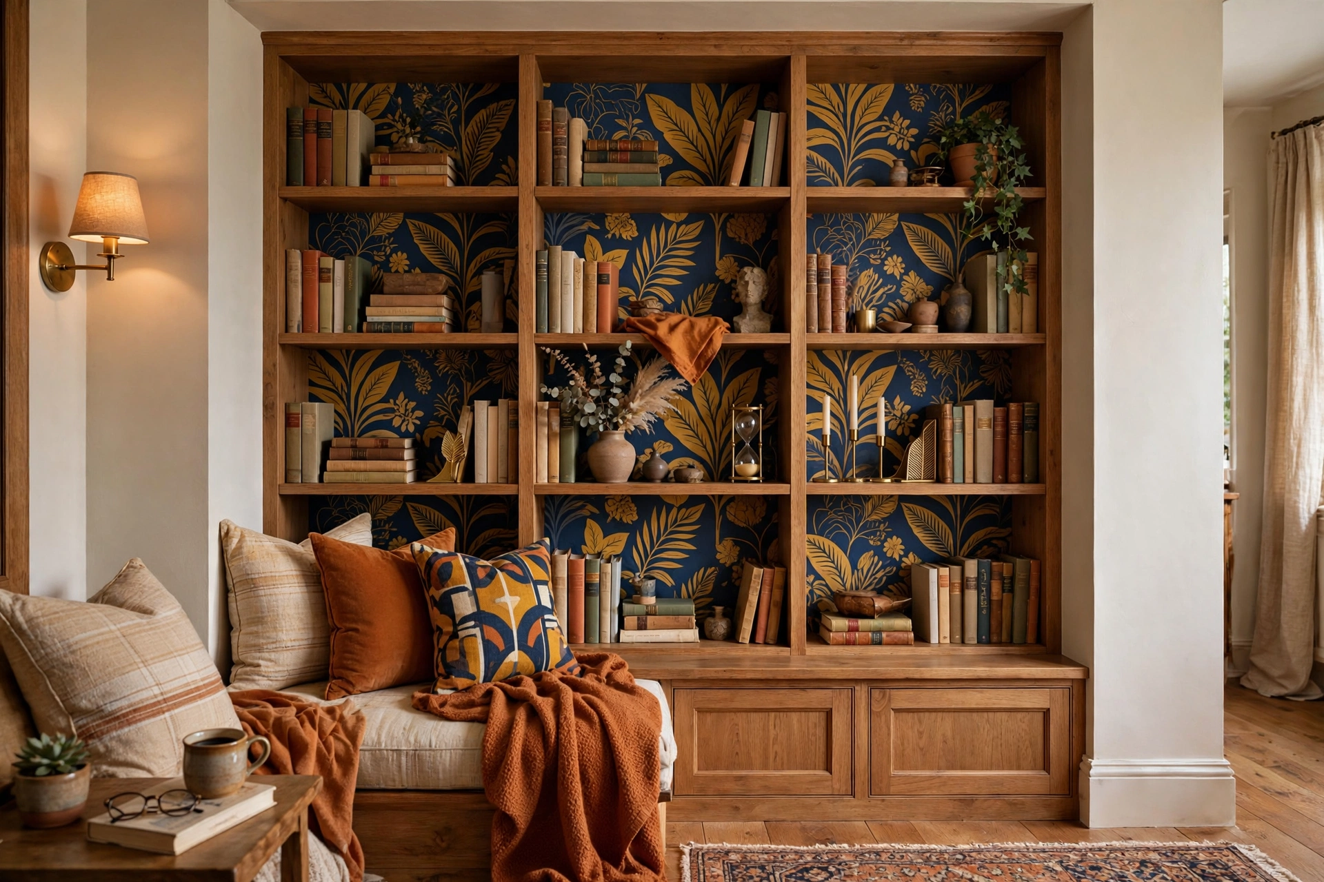
You do not need full walls to get wallpaper drama. Lining the backs of open bookshelves, alcoves, or a bar nook with paper creates jewel-like moments that draw the eye across the room. It is also the most budget-friendly entry point: a single roll often covers several shelves, and offcuts from a bigger project work perfectly.
Choose a pattern with enough contrast to read behind books and objects — small geometrics, tone-on-tone damasks, or a bold color that frames your shelves like art. Cut the paper slightly oversized, apply it to removable boards that slot into the shelves, and you can swap the look seasonally without touching the furniture. For styling what goes in front of the paper, our living room gallery wall ideas with personality share the same layering instincts — curated groupings that let the background shine through.
13. Pick Pasted Wallpaper for a Seamless Finish
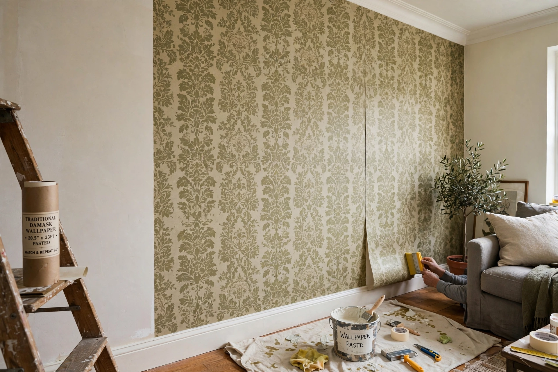
Traditional pasted wallpaper — paste-the-wall or paste-the-paper — still gives the flattest, most seamless finish, especially for heavyweight, textured, and wide-width designs. Seams virtually disappear when strips are butted correctly, and the paper’s rigidity forgives slightly imperfect walls better than thin peel-and-stick does.
Yes, it takes more skill and a second pair of hands, but the result lasts a decade or more. Paste-the-wall varieties are the easiest do-it-yourself entry point: roll paste directly onto the wall, then hang dry strips — no soaking table, no soggy paper. Book each strip, folding the pasted sides together, for the recommended minutes so it expands before hanging, or you will get shrinkage gaps at the seams. For a forever home’s main living space, pasted paper is worth the weekend of effort.
14. Use Metallics to Bounce Light Around
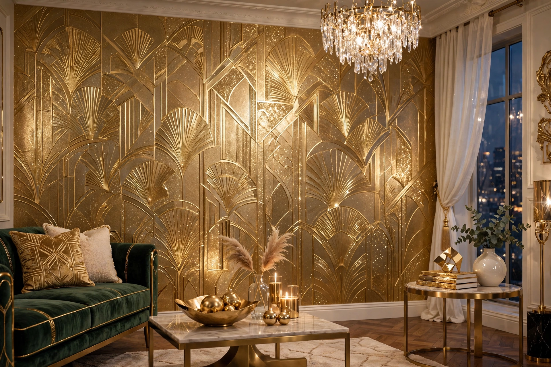
Metallic inks, foil prints, and gilded details turn wallpaper into a light feature. Gold, silver, and copper motifs catch lamplight and daylight, adding shimmer that shifts as you move through the room. In a north-facing living room starved of sun, a metallic paper can fake some of the glow you are missing.
Use metallics strategically: a full room of high-shine foil can feel busy, but one feature wall — or a paper where metallic is just an accent thread in the design — adds glamour without glare. Keep nearby finishes in the same metal family for cohesion: brass lamps with gold paper, chrome with silver. Go easy on competing shine elsewhere and let the walls do the sparkling while the furniture stays matte and grounded.
15. Sample Before You Commit
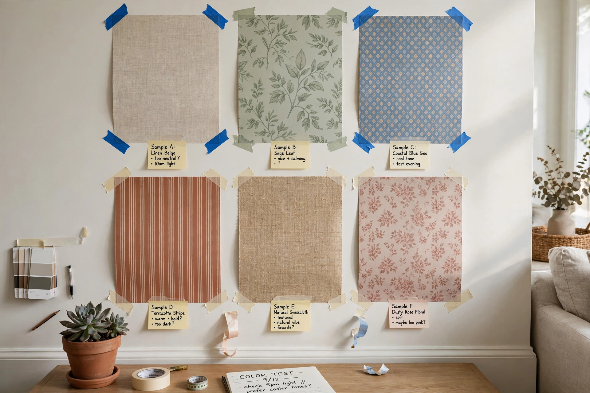
The cheapest insurance in decorating is a wallpaper sample. Colors shift dramatically between screen, sample, and full wall — that soft sage can read mint or gray depending on your light. Order large samples, tape them up, and observe them across several days in both natural and artificial light before spending a cent on rolls.
Check the practical details on the sample too: how the seams butt together, whether the paper stretches when damp, and how the colorway sits next to your sofa fabric and flooring. Many manufacturers sell inexpensive swatches, and some shops let you return unused rolls. A week of living with samples beats a weekend of regretting a full room — every professional designer does this, and now you know why.
Frequently Asked Questions
Is wallpaper a good idea for a living room?
Yes — the living room is the best room in the house for wallpaper because it is where pattern gets seen and enjoyed every day. Unlike a bedroom, where calm usually wins, a living room can carry real drama: bold murals, dark moody prints, and metallic finishes all shine here. Choose durable, scrubbable papers such as vinyl or vinyl-coated designs, since living rooms get the most traffic, fingerprints, and sunlight. With the right paper, a single wall can replace thousands spent on art and decor.
How much does it cost to wallpaper a living room?
Expect roughly two hundred to six hundred dollars for a single do-it-yourself accent wall using mid-range paper, including paste and tools. A professional hang of one wall typically runs four hundred to a thousand dollars or more, depending on your market and the paper you choose. Full rooms multiply fast, especially with large-repeat patterns that increase waste at every seam. Peel-and-stick sits at the budget end per roll but adds up on big walls. Always order ten to fifteen percent extra — running short mid-project with a dye-lot mismatch is the most expensive mistake of all.
Can I put wallpaper on textured living room walls?
Light orange-peel texture is usually fine under thicker papers like grasscloth or heavyweight vinyl, but heavy knockdown or popcorn texture will telegraph straight through and ruin the finish. For best results, skim-coat and sand problem walls first — or use texture as camouflage by choosing embossed and heavily textured papers, which hide minor imperfections far better than smooth, shiny ones. When in doubt, hang a test strip and check it in raking side light before committing to the whole wall.
Peel-and-stick vs traditional wallpaper: which is better?
It depends on your timeline. Peel-and-stick wins for renters and the commitment-shy: no paste, repositionable strips, and clean removal. Traditional pasted paper wins for longevity and finish — it lies flatter, suits textured and wide-width designs, and lasts a decade or more. For a living room you will keep for years, pasted is the professional choice; for a rental or a trend you might tire of, peel-and-stick is the smart one.
How do I choose a wallpaper color for my living room?
Pull the color from something already in the room — your rug, sofa, or favorite artwork — so the paper feels connected rather than random. North-facing rooms benefit from warm undertones, while south-facing rooms can handle cooler palettes. Dark papers create cozy drama but demand good lighting; light papers keep small rooms feeling airy. Tape up large samples and view them in the morning and evening before deciding.
Keep Exploring
Wallpaper is the fastest route from plain to unforgettable — one wall, one pattern, and your living room has a backdrop with real personality. Start with a sample, trust your light, and do not fear the bold choice; the rooms you remember are never the beige ones. Now go find the pattern that feels like you, and enjoy watching a flat wall turn into the best seat in the house.