
Color sets the emotional temperature of a bedroom more than any other design choice. The right palette can slow a racing mind, soften morning light, and make the room feel like a genuine retreat from the day. These bedroom color palette ideas focus on combinations that promote rest — soothing, balanced, and livable long after the paint dries.
Whether you love airy neutrals, soft blues, earthy greens, or cocooning dark tones, there is a calming palette here for your style and your room’s light. Each idea includes the core colors, how to balance them, and where to place each tone so the result feels intentional. This guide also answers the practical questions about choosing palettes, the 60-30-10 rule, and whether your walls should go light or dark.
1. Soft White and Warm Beige Neutrals
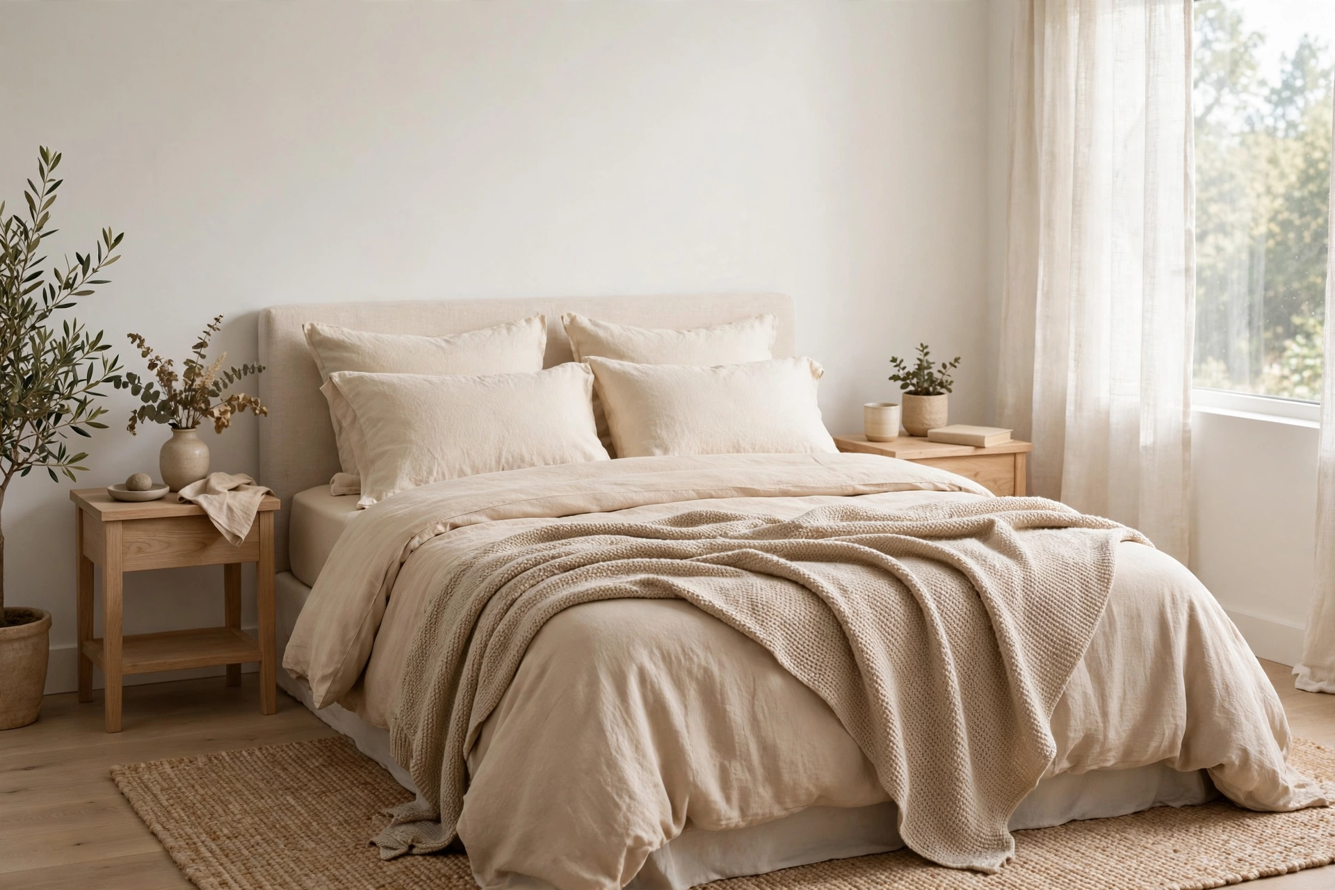
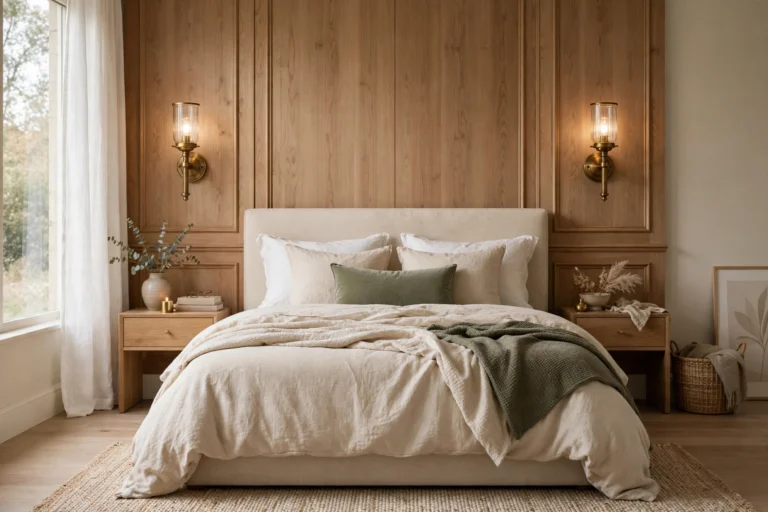
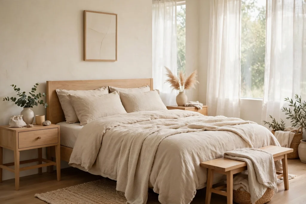
The ultimate calming palette is also the simplest: soft white walls with layers of warm beige, oatmeal, and cream. This combination feels like a deep breath — clean but never cold, thanks to warm undertones in every layer. Keep whites slightly creamy rather than stark to avoid a clinical feel, and layer textures (linen bedding, wool throws, a jute rug) so the neutrals have depth. Wood tones in light oak or walnut add warmth without introducing new colors. This palette suits every style from Scandinavian to modern farmhouse and makes small bedrooms feel larger. It is also the easiest to refresh seasonally with a single accent swap.
2. Sage Green and Cream
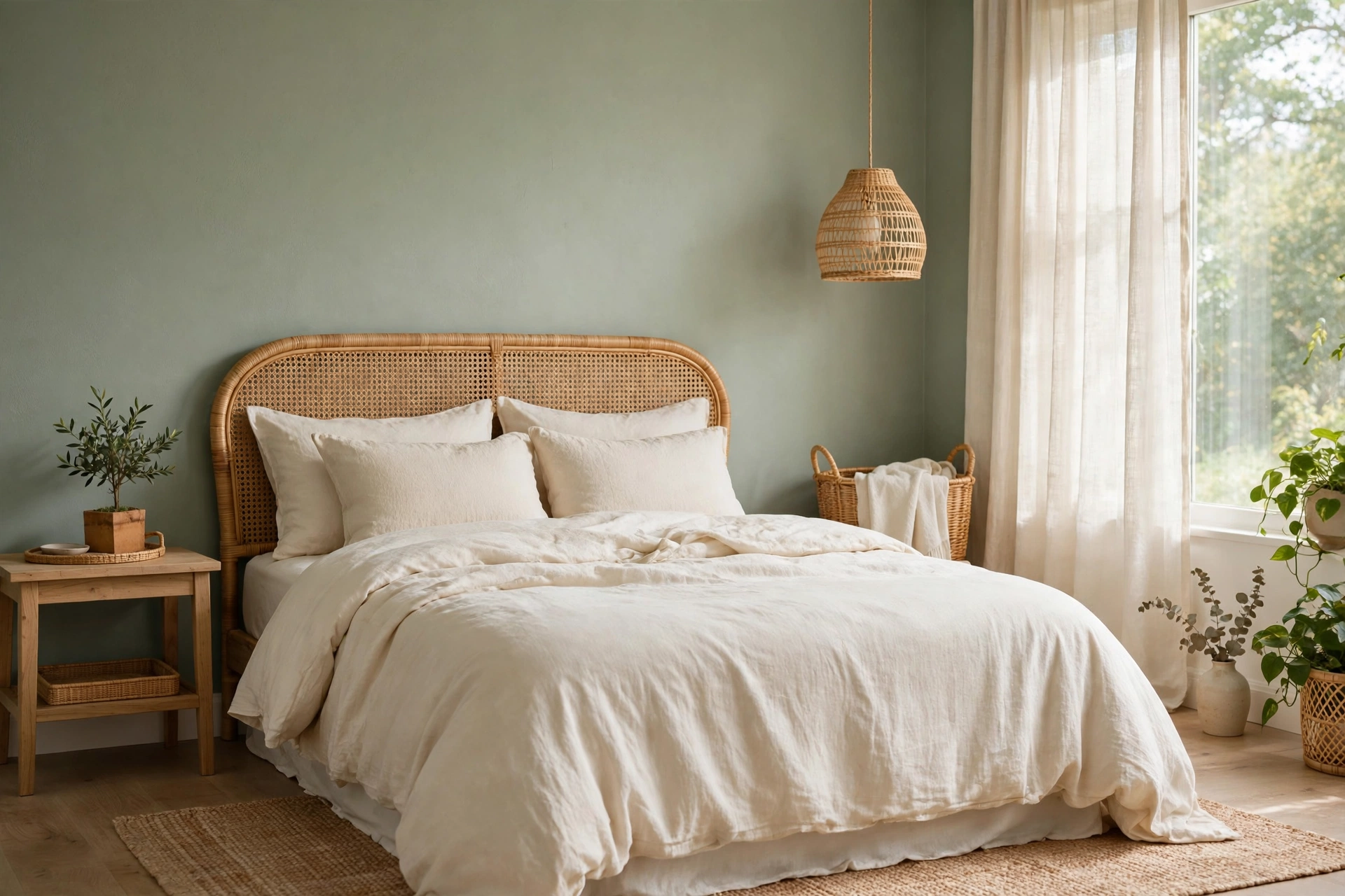
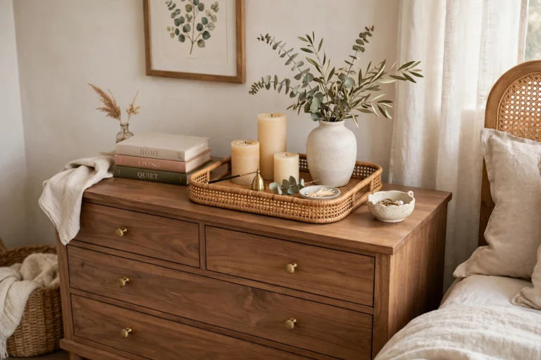
Sage green brings the calm of nature indoors without the intensity of deeper greens. Paired with warm cream walls or bedding, it creates a soft, botanical serenity that feels both fresh and timeless. Use sage on the walls for full immersion or as an accent — bedding, curtains, an upholstered headboard — against cream surroundings. Natural wood and rattan textures amplify the organic feel. This palette flatters most skin tones in morning light and pairs beautifully with brass or black hardware. Sage green bedroom design ideas calm and timeless explore sage in every shade from whisper-soft to richly saturated.
3. Powder Blue and White
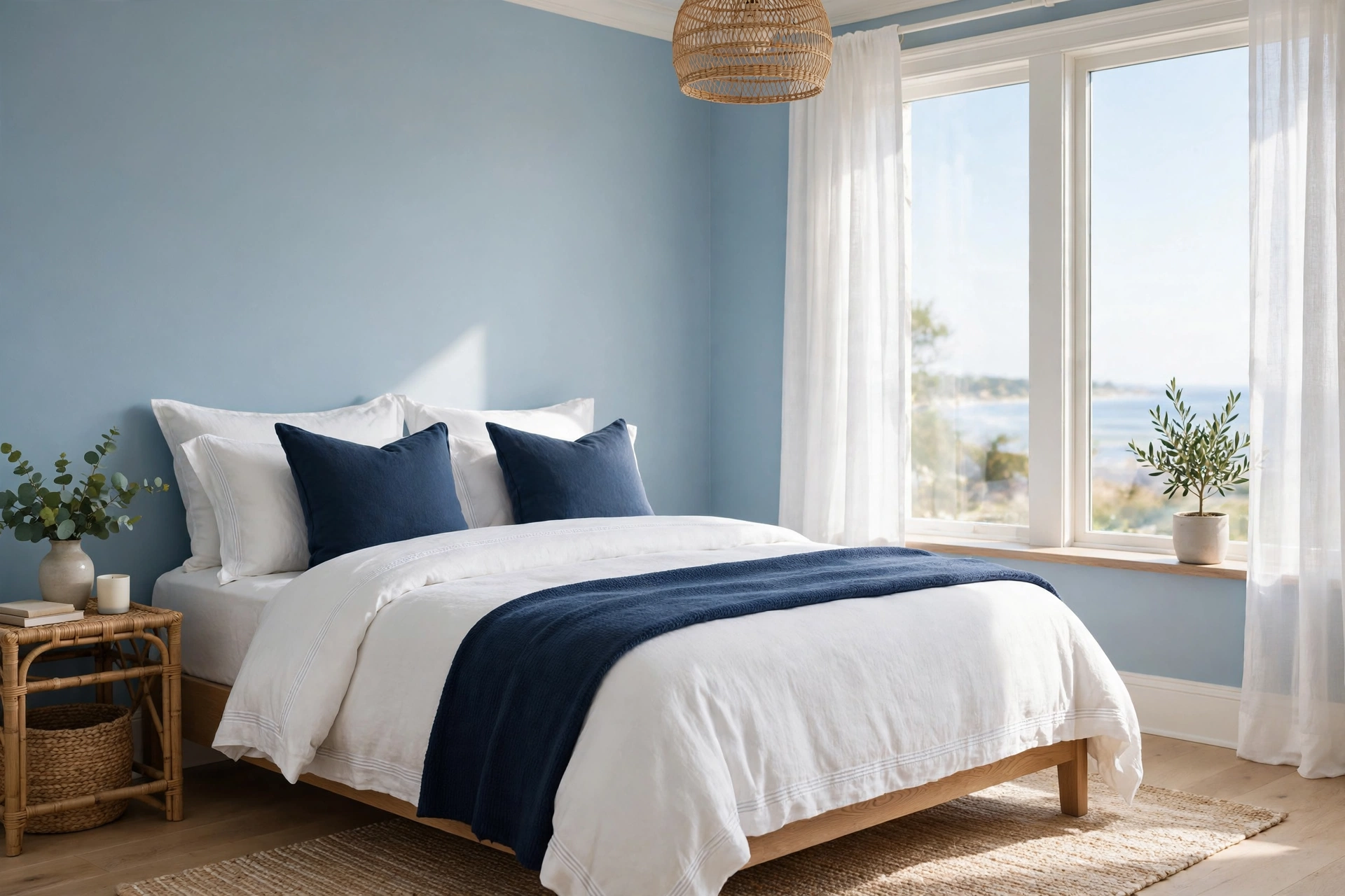
Few colors calm like soft blue — it is psychologically linked to lower heart rates and better sleep. Powder blue walls with crisp white trim and bedding create a serene, airy bedroom that feels like a clear morning sky. Layer in deeper blue accents (a navy throw, indigo pillows) for depth so the palette does not float away. This scheme works beautifully in bedrooms with abundant natural light and suits coastal, traditional, and transitional styles. Powder blue decorating ideas show the shade paired with everything from crisp white to warm brown for fresh, clean palettes. Keep metals light — chrome, brushed nickel — to preserve the airy feel.
4. Warm Greige With Wood Tones
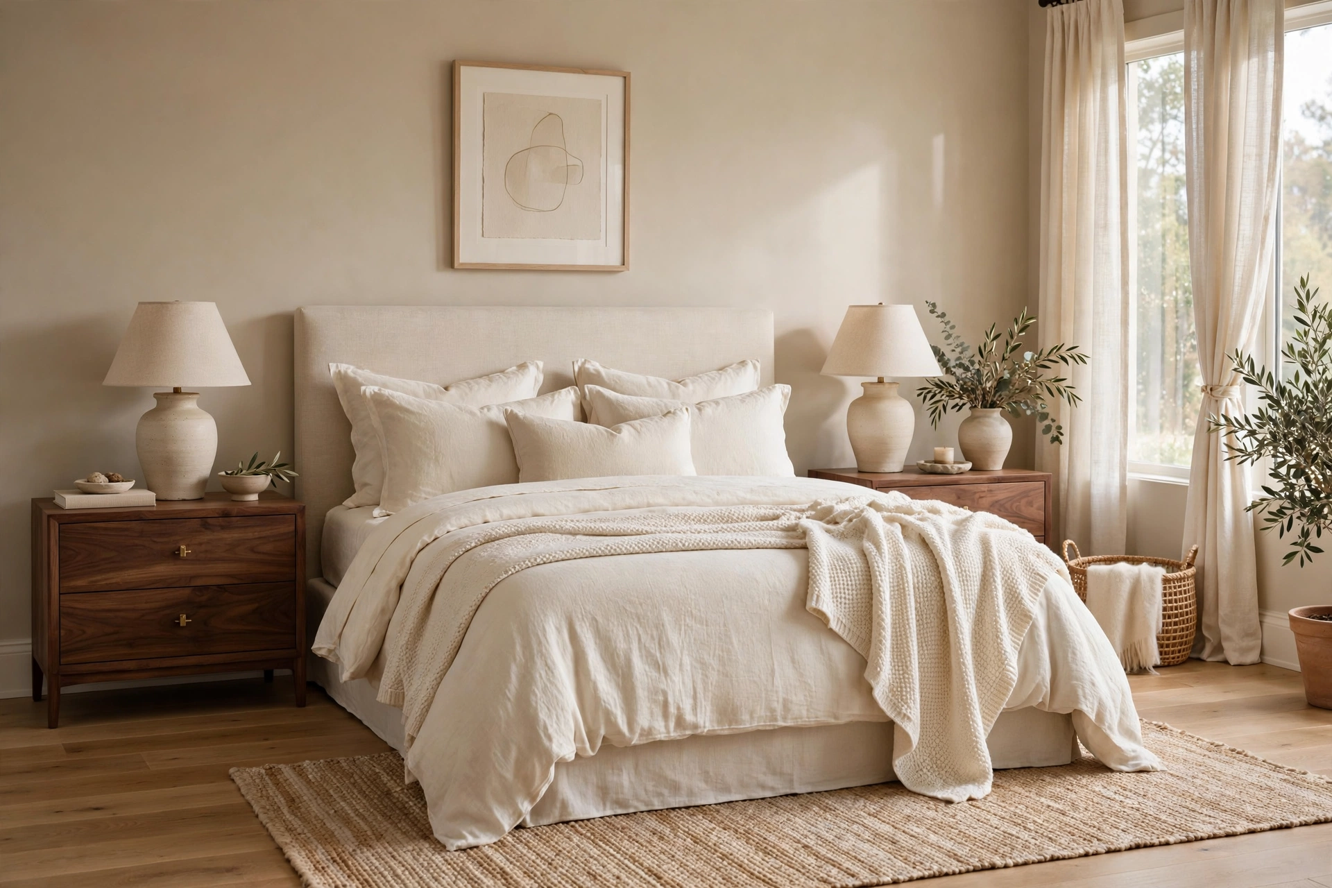
Greige — the perfect marriage of gray and beige — is the sophisticated neutral that replaced cold gray. Warm greige walls with rich wood tones (walnut nightstands, oak floors) create a grounded, cocooning calm that feels grown-up and serene. The warmth in greige keeps it from reading flat or chilly, especially in north-facing rooms with cool light. Layer cream and ivory textiles to keep the palette from going too dark, and add one deep accent — forest green or cognac leather — for richness. This palette is a designer favorite for primary bedrooms because it feels both calm and luxurious. Test greige samples at different times of day; undertones shift dramatically in changing light.
5. Blush Pink and Soft Gray
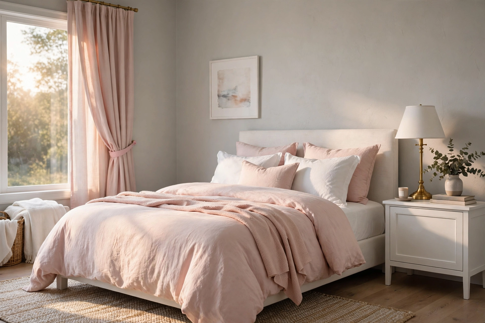
Blush pink has grown up: paired with soft warm gray, it reads as sophisticated calm rather than sweet. Use blush on bedding, curtains, or an upholstered headboard against pale gray walls for a gentle, romantic serenity. The gray grounds the pink so the room feels balanced, not girly. Add white for freshness and a touch of brass for warmth. This palette suits bedrooms that get warm afternoon light beautifully, and it flatters a wide range of wood tones from light oak to dark walnut. Keep patterns subtle — a soft floral or quiet stripe — so the colors stay the stars. It is a lovely choice for a restful yet personal retreat.
6. Navy and Crisp White
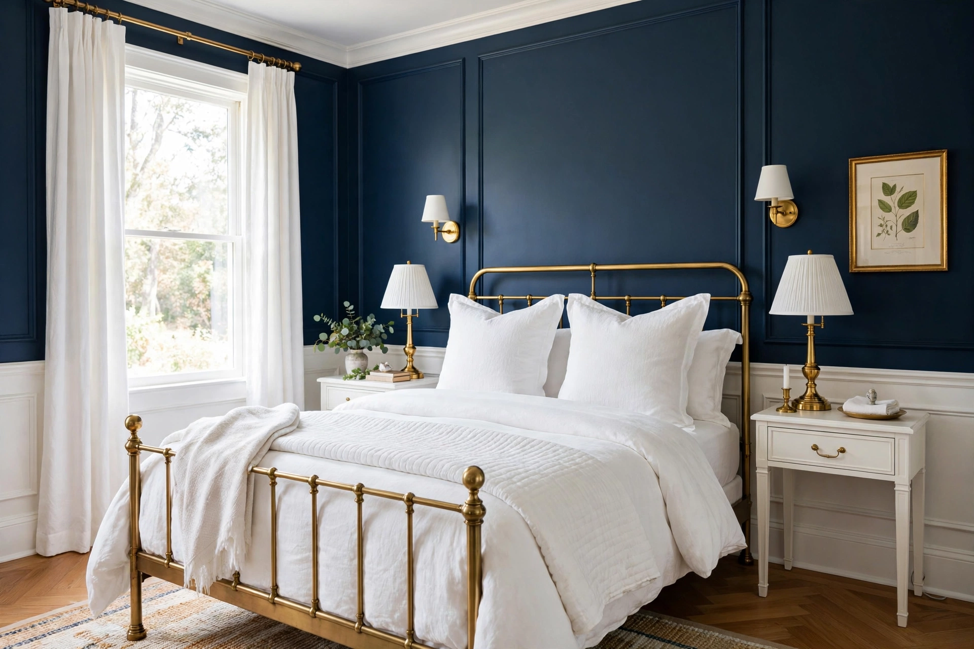
For calm with contrast, navy and white deliver classic serenity with backbone. Navy walls create a cocooning, sleep-promoting darkness, while crisp white bedding and trim keep the room feeling fresh rather than heavy. This high-contrast palette suits traditional, coastal, and modern bedrooms alike. Balance is key: if all four walls go navy, keep the ceiling white and the textiles light; for a softer take, use navy on one accent wall or just in bedding. Brass or gold accents warm the cool navy beautifully. Navy is also wonderfully forgiving — it hides scuffs and makes white bedding look impossibly crisp. A timeless pairing that never feels trendy.
7. Terracotta and Warm Sand
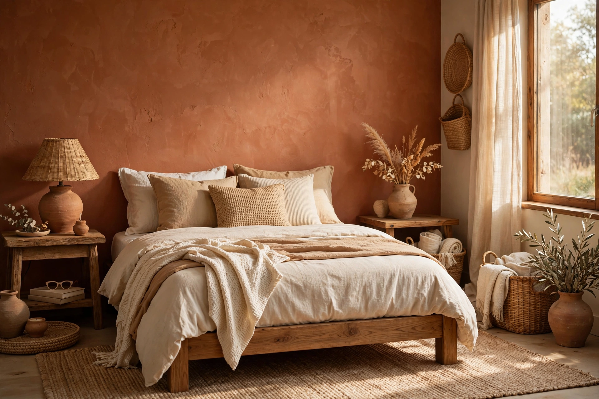
Earthy terracotta with warm sand tones brings sun-baked warmth that feels grounding and calm. This palette suits bedrooms craving coziness — terracotta on an accent wall or in textiles, sand and cream everywhere else. Natural materials amplify the effect: clay, wood, linen, and woven textures all belong here. The warmth is enveloping without the intensity of true red or orange, making it restful rather than energizing. It pairs naturally with Mediterranean, boho, and Southwestern styles. If full terracotta walls feel bold, start with bedding and curtains and let the palette grow. Plants thrive visually in this warm, earthy scheme.
8. Charcoal and Warm Ivory
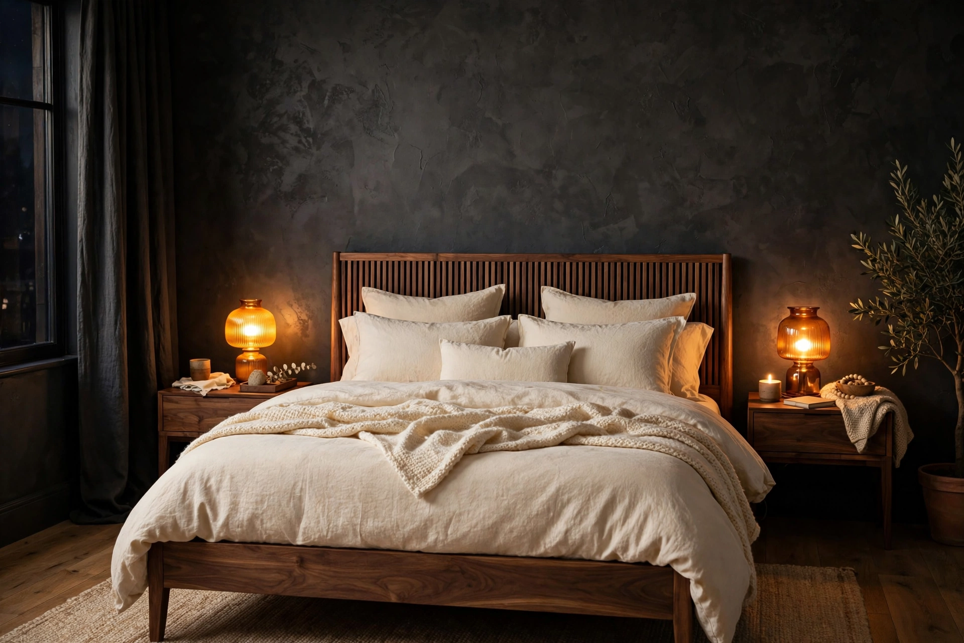
Dark bedrooms can be deeply calming — charcoal walls absorb light and visual noise, creating a true sleep sanctuary. The trick is warming it up: pair charcoal with warm ivory bedding, amber lighting, and wood or brass accents so the room feels cocooning rather than cave-like. Keep the ceiling light — soft white or pale ivory — to avoid a pressing feeling overhead. This palette suits good sleepers and rooms with strong natural light that can handle the depth. Layer textures generously: velvet, wool, and linen all glow against dark walls. For drama without coldness, charcoal beats pure black every time in a bedroom.
9. Lavender Gray and White
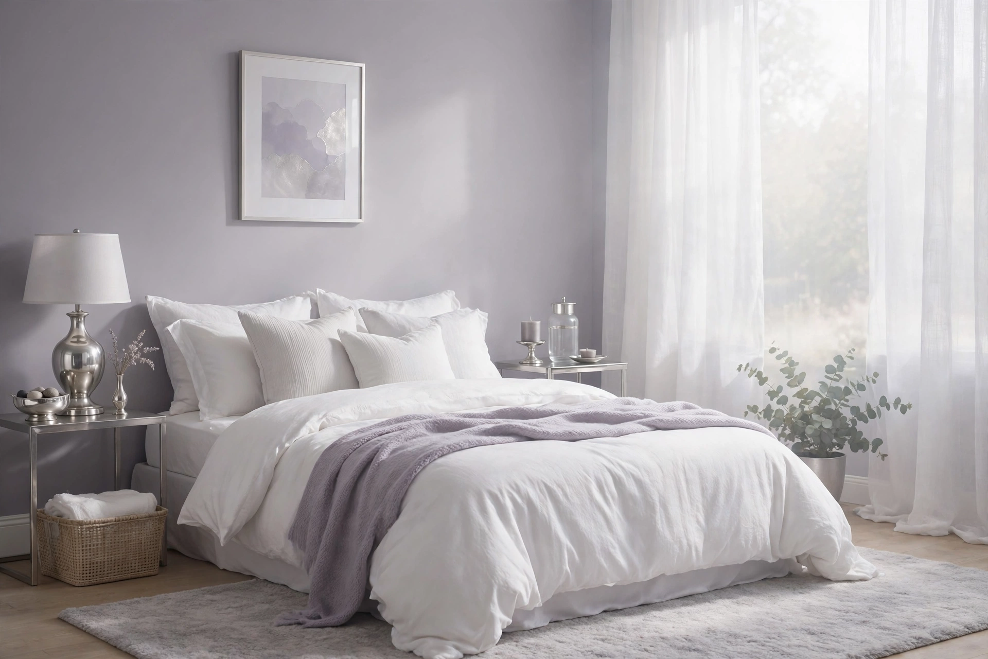
Lavender gray — gray with a whisper of purple — brings a dreamy, tranquil quality that plain gray lacks. Paired with white, it creates a soft, ethereal bedroom that feels calm at every hour. Use it on walls for a gentle wash of color, or keep walls white and bring lavender gray in through bedding and curtains. Silver and chrome accents suit its cool nature, while warm wood prevents chilliness. This palette is lovely in bedrooms with soft, diffused light and suits romantic, modern, and transitional styles. Keep the lavender muted — too much saturation tips from serene to sugary. A whisper is all you need.
10. Olive Green and Natural Linen
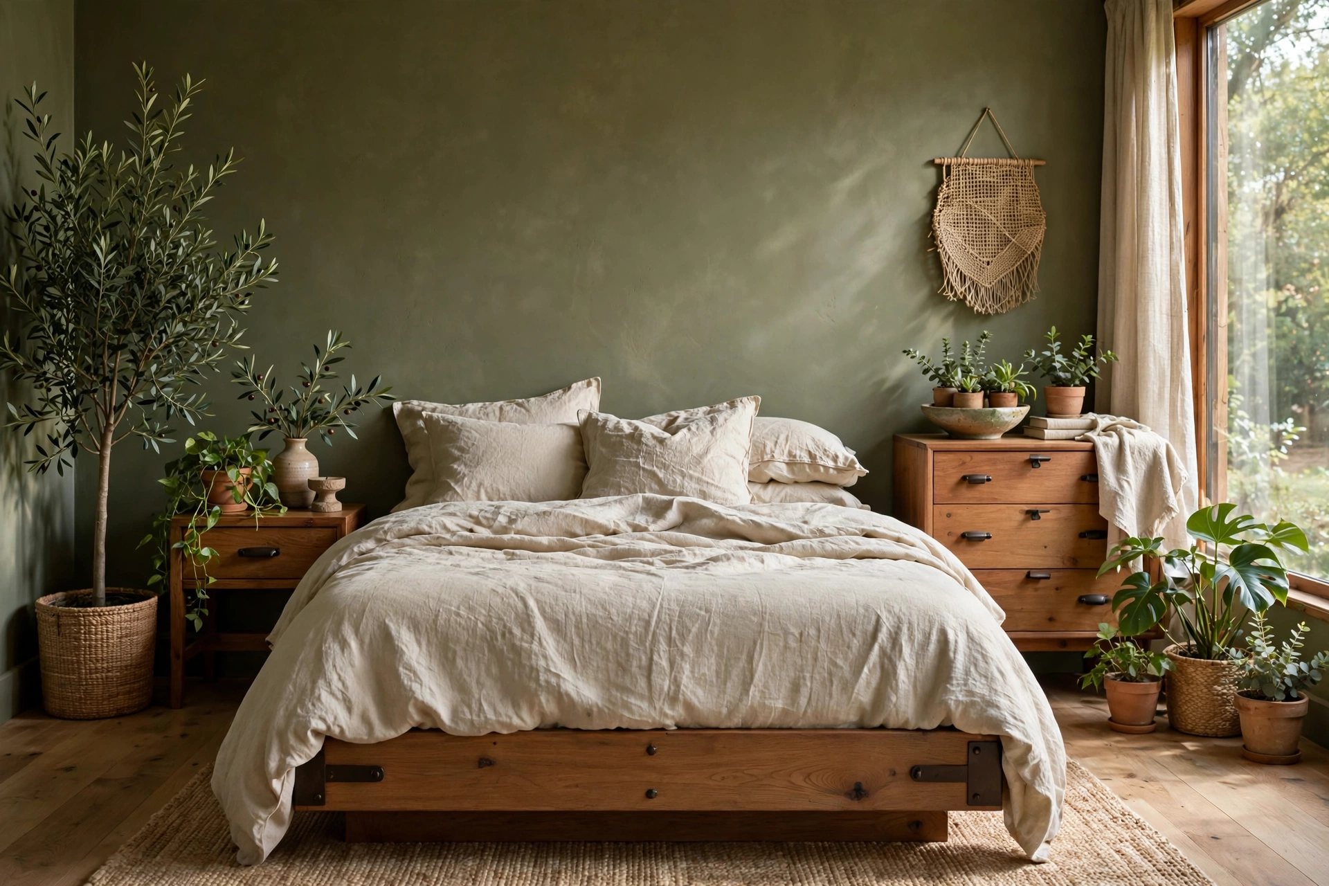
Olive green is nature’s neutral — earthy, sophisticated, and deeply calming. Paired with natural linen in oatmeal and flax tones, it creates a bedroom that feels like a quiet grove. Use olive on walls for richness or in bedding and curtains against warm white walls for a lighter touch. Black or dark bronze hardware adds definition; natural wood keeps it organic. This palette suits both modern and rustic bedrooms and looks stunning with plants. Olive’s yellow undertone warms the room, making it a great choice for spaces with cool northern light. It is green for people who find sage too sweet and forest too dark.
11. Warm Taupe Monochrome
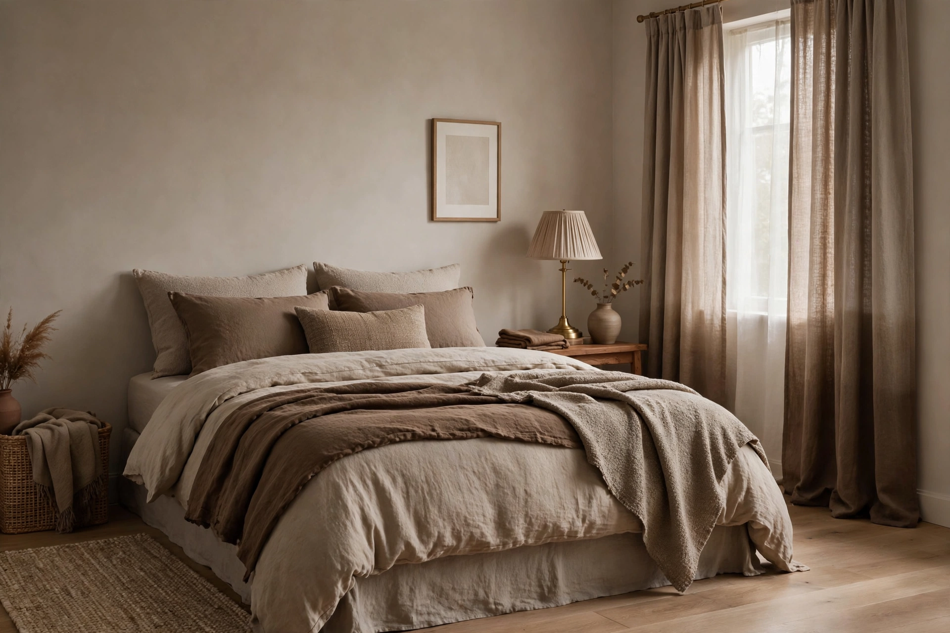
A monochromatic palette of warm taupe — walls, bedding, and curtains in layered tones of the same family — creates profound calm through simplicity. The key is varying texture and tone: matte walls, nubby linen bedding, a plush rug, smooth wood. Without color contrast to distract, the eye rests and the mind follows. Add depth with tones ranging from pale mushroom to deep coffee, keeping everything in the warm family. One metallic accent — brass or bronze — prevents flatness. This palette is the most restful of all for visually sensitive sleepers. Bedroom accent wall ideas with paint and texture show how plaster, paneling, and limewash add depth without new colors.
12. Deep Teal and Brass Accents
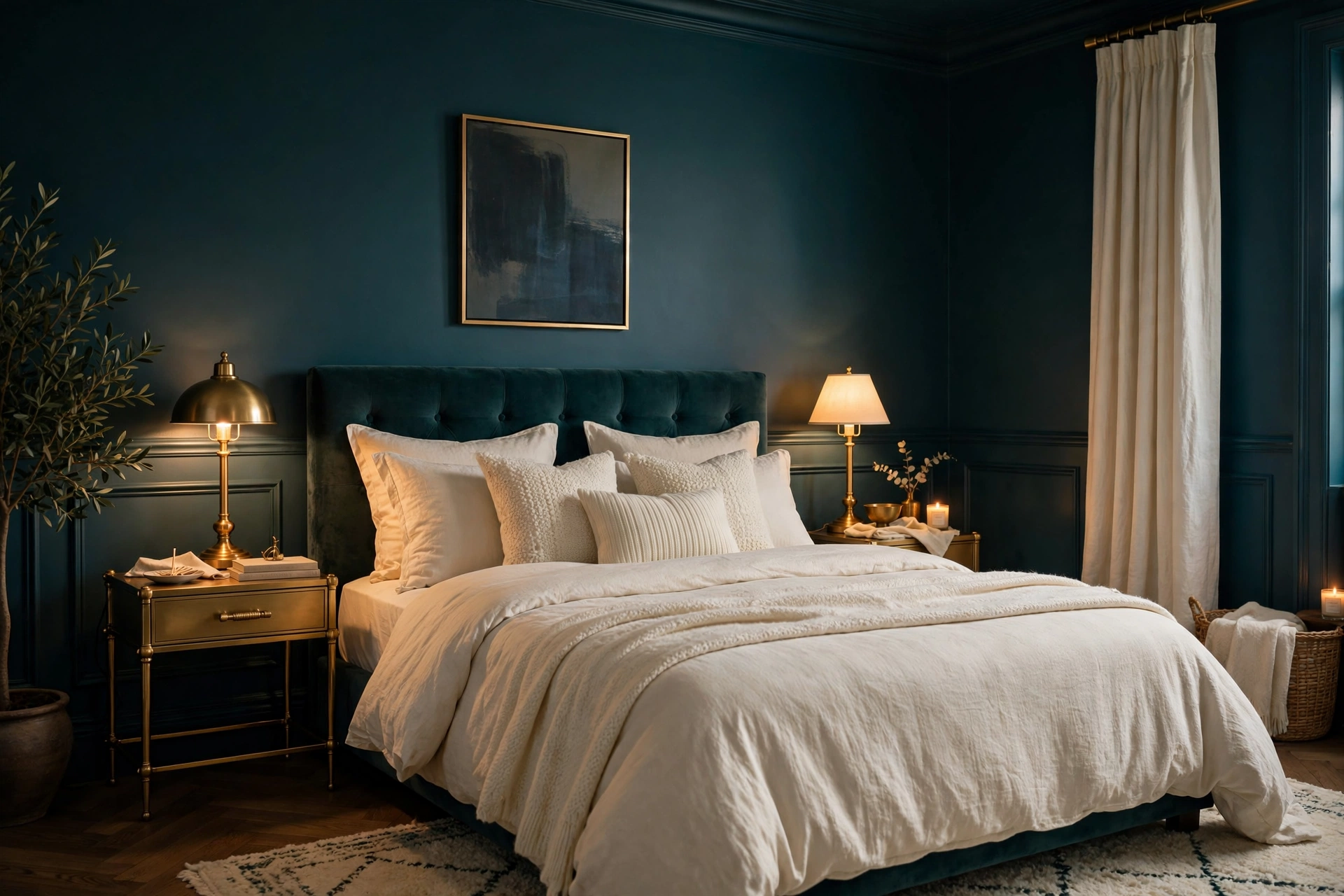
Deep teal brings jewel-box richness that still reads as calming — it is blue’s serenity deepened with green’s grounding. Paired with brass or gold accents, it feels luxurious and cocooning, perfect for a primary bedroom retreat. Use teal on walls or a headboard wall, balance with warm white or cream textiles, and let brass lighting and hardware glow against the depth. This palette suits moody, sophisticated styles and rooms with good natural light. Keep the ceiling light and the bedding pale so the teal does not overwhelm. A little teal goes a long way — even curtains or bedding in the shade deliver the mood.
13. Soft Yellow and Cream
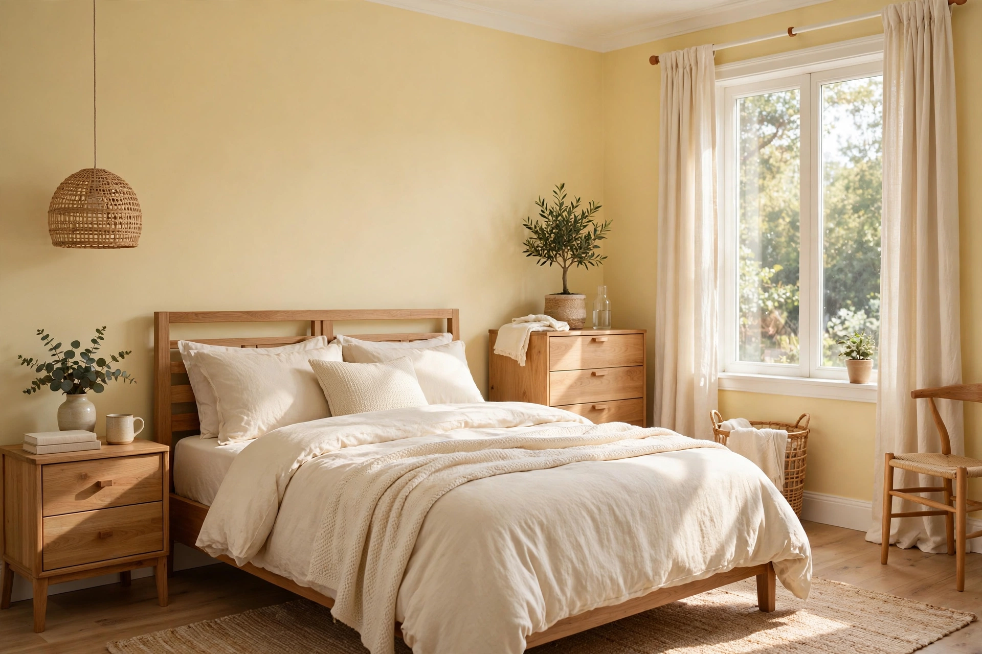
Soft, buttery yellow with cream creates a bedroom that wakes you gently — sunny without being stimulating. The key is keeping the yellow pale and warm, like morning light rather than midday sun. Use it on walls for a happy glow or in bedding against cream walls for a subtler effect. White trim keeps it fresh; natural wood adds grounding. This palette suits east-facing bedrooms that get gentle morning light and anyone who wants a bedroom that feels optimistic yet restful. Avoid pairing with stark white, which can make pale yellow look dingy — cream is the better partner. A cheerful calm for light-filled rooms.
14. Black and White With Warm Wood
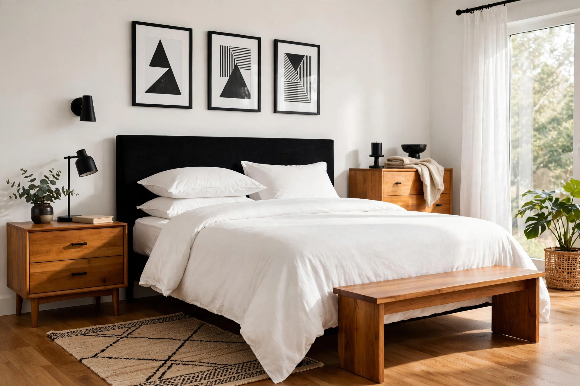
High-contrast black and white gains bedroom calm when warm wood enters the mix. Crisp white bedding, black accents (a headboard, frames, lighting), and honey-toned wood floors or furniture create a graphic yet grounded serenity. The wood is essential — without it, the palette can feel stark; with it, the room feels balanced and warm. Keep black to accents and one statement piece rather than large surfaces so the room stays restful. This palette suits modern, Scandinavian, and minimalist bedrooms. Trending color scheme ideas highlight black and white as a timeless duo that works in any room — and the bedroom is no exception when warmed with wood.
15. Muted Plum and Dusty Rose
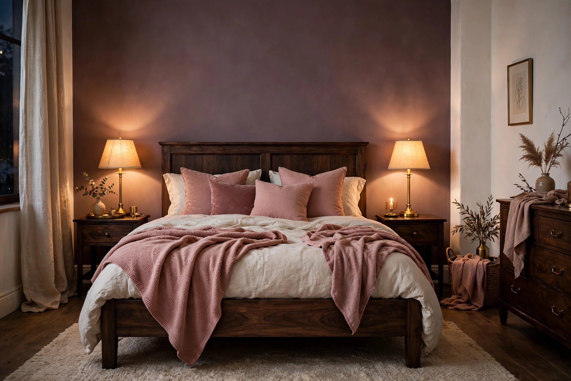
Muted plum — dusky, grayed purple — with dusty rose creates a romantic, cocooning calm with unusual depth. Use plum on an accent wall or in bedding against warm white walls, layering dusty rose through pillows, throws, and curtains. The combination feels rich and enveloping without the heaviness of true purple. Brass or gold accents add warmth; dark wood grounds it. This palette suits bedrooms that need coziness and drama in equal measure, and it glows beautifully in lamplight. Keep the plum muted — gray undertones are what make it restful rather than regal. Bedroom curtain ideas for privacy light and style cover fabrics and colors that filter light beautifully.
Frequently Asked Questions
What is the most calming color for a bedroom?
Soft blue consistently ranks as the most calming bedroom color — it is associated with lower heart rates, reduced anxiety, and better sleep. Sage green and warm neutrals like beige and greige are close contenders, bringing nature’s calm indoors. The most calming choice also depends on you: if blue feels cold to you, a warm neutral will rest you more. Whatever hue you choose, keep saturation low — muted, dusty versions of any color calm more than bright ones. Test large swatches in your room’s light before committing.
How do I choose a color palette for my bedroom?
Start with how you want the room to feel, then pick one dominant color that delivers it. Pull two supporting tones from your bedding, rug, or artwork so the palette connects to things you already love. Consider your room’s light: north-facing rooms need warmer tones, south-facing rooms can handle cooler ones. Limit the palette to three main colors plus neutrals to keep it cohesive. When in doubt, choose the quieter version of any color — restraint reads as calm.
What is the 60-30-10 rule for bedroom colors?
The 60-30-10 rule distributes color for balance: 60% dominant color (usually walls and large furniture), 30% secondary color (bedding, curtains, rug), 10% accent (pillows, art, decor). In a bedroom, that might mean 60% warm white walls, 30% sage bedding and curtains, 10% brass and wood accents. The rule prevents any one color from overwhelming the room and guarantees a layered, designer look. It is a guideline, not a law — adjust ratios to taste, but keep one color clearly dominant for calm.
Should bedroom walls be light or dark?
Both can be calming — it depends on the effect you want. Light walls (white, cream, pale blue) make rooms feel larger, airier, and more serene, and they suit small bedrooms and morning people. Dark walls (navy, charcoal, deep green) create a cocooning, sleep-promoting sanctuary that quiets visual noise, best in rooms with good natural light. If undecided, try dark on one accent wall behind the bed — you get the cocoon effect where it matters most while keeping the room bright.
Can I mix warm and cool colors in a bedroom?
Yes — in fact, the most sophisticated palettes balance both. A predominantly cool palette (blues, grays) benefits from warm wood, brass, or cognac accents to avoid feeling sterile. A warm palette (beiges, terracotta) gains freshness from a cool accent like sage or dusty blue. The key is letting one temperature dominate (about 70/30) so the room has a clear identity. Use the 60-30-10 framework to place them intentionally. Balanced temperature is what makes a palette feel rich rather than flat.
Keep Exploring
Color is the fastest way to change how a bedroom feels — and the most personal. Whether you choose the deep calm of navy, the organic serenity of sage, or the enveloping warmth of taupe monochrome, these bedroom color palette ideas give you combinations proven to rest the eye and quiet the mind. Start with large samples, live with them through different lights, and trust the palette that makes you exhale.
Once your colors are set, let them guide everything else — the bedding layers, the curtain fabric, the art on the walls. Browse more Bedroom Decor inspiration to build a room around your palette, because the calmest bedrooms are the ones where every choice speaks the same quiet language.