The galley kitchen has an unfair reputation — and it’s time to challenge it. Named after the narrow, efficient cooking spaces on ships and aircraft, the galley is frequently dismissed as a compromise layout: what you get when you can’t have the open-plan kitchen-diner you really wanted. But here’s the truth that professional cooks and designers know: the galley kitchen is, in many ways, the most efficient kitchen layout that exists.
Everything is within arm’s reach. The workflow between fridge, prep surface, and hob is tight, logical, and fast. Every centimetre of wall is available for cabinetry. The right design turns a galley kitchen into a precision instrument — a space where cooking is fluid, intuitive, and genuinely pleasurable in a way that sprawling, inefficient open-plan kitchens often aren’t.
The challenge is making it feel beautiful, bright, and spacious as well as efficient. These 12 galley kitchen design ideas will show you exactly how — from the foundational layout decisions to the small styling details that make a galley kitchen genuinely extraordinary.
━━━━━━━━━━━━━━━━━━━━━━━━━━━━━━━━━━━━━━━━
1. Decide: One Wall or Two?

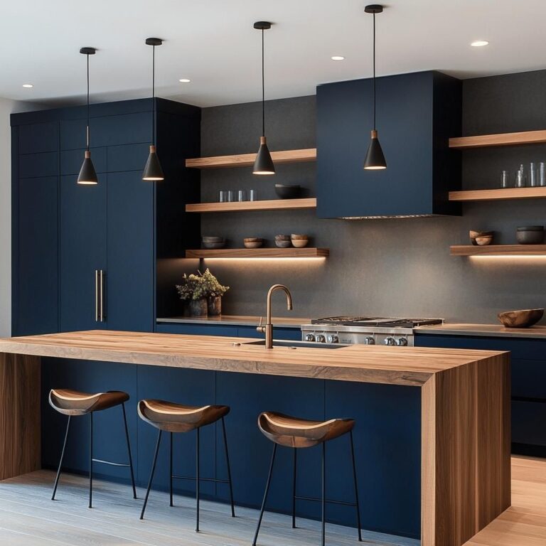
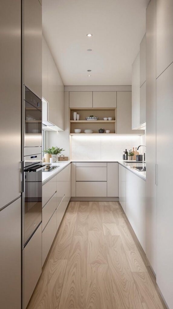
The first design decision in a galley kitchen — and one that many people inherit rather than choose — is whether cabinetry runs along one wall or both. A one-wall galley kitchen (all cabinetry and appliances on a single wall, with open or minimal storage opposite) feels more open and less tunnel-like, but sacrifices storage and workspace. A two-wall galley maximises storage and counter space but creates the corridor effect that can feel cramped if not handled correctly.
If you have a choice, two walls is almost always the more practical decision — the additional counter space and storage are too valuable to sacrifice for the slightly more open feel of a single-wall layout. But the two-wall design requires more deliberate design attention to prevent it feeling narrow and claustrophobic. The good news: with the right colour, lighting, and detail choices, a two-wall galley kitchen can feel genuinely spacious and beautifully resolved. The ideas in this post will show you how.
2. Keep the Floor Plan Clear — Resist Every Storage Temptation

In a galley kitchen, the floor space between the two cabinet runs is the room’s most precious resource — and it must be protected with the same discipline that a designer applies to any small space. The temptation in a narrow kitchen is to add freestanding storage, a trolley, a bin unit, or any number of objects that appear to solve a problem but actually make the kitchen feel significantly more cramped. Resist every one of them.
The corridor between the two cabinet runs should be completely clear of freestanding items: no trolleys, no standalone appliances, no items that don’t belong in fixed storage. The minimum comfortable corridor width in a galley kitchen is 90cm — anything narrower starts to feel genuinely constricted. If your galley is narrower than 90cm between the faces of opposite units, prioritise removing anything that reduces this dimension further. Every centimetre of clear floor width makes the kitchen feel measurably better.
3. Use Light Colour on Cabinetry to Open Up the Space

Colour is one of the most powerful tools for making a galley kitchen feel more spacious than it is — and in a narrow space, the choice between light and dark cabinetry has a more dramatic effect on the room’s perceived size than in any other kitchen format. Light-coloured cabinetry reflects more light, reduces the visual weight of the walls, and makes the kitchen feel more open and airy. Dark cabinetry absorbs light and makes the walls feel closer.
White, warm ivory, pale grey, or soft sage green are all excellent galley kitchen cabinetry colours — they keep the space light and bright while allowing the kitchen to have genuine personality and warmth. If you love a dark cabinet colour, consider applying it to only one wall (typically the less-lit one) and keeping the other wall in a lighter tone. This creates depth and interest without the full enclosing effect of dark colour on both walls. Pair light cabinetry with a light-coloured worktop for the most open-feeling result.
4. Maximise Natural Light — and Supplement It Generously

Light is the galley kitchen’s most valuable resource and most challenging limitation. A galley with good natural light — a window at one or both ends, or a skylight above — is transformed. A galley with no natural light can feel genuinely oppressive without deliberate artificial lighting throughout. Understanding and maximising every available light source is one of the most important galley kitchen design priorities.
If natural light is limited, prioritise these artificial lighting layers: under-cabinet LED strip lights on both sides of the galley, casting warm light directly onto the worktops (the most important galley lighting element); ceiling-mounted pendant lights or recessed downlights running down the centre line of the corridor; and if possible, a light-coloured splashback that reflects light rather than absorbs it. A mirrored or glossy splashback opposite a window bounces natural light beautifully and makes the kitchen feel significantly brighter. Warm-toned bulbs throughout — 2700K — prevent the bright, well-lit galley from feeling cold or clinical.
5. Choose Handleless Cabinets to Maximise Corridor Width

In a galley kitchen where corridor width is at a premium, the presence or absence of cabinet handles has a surprisingly meaningful impact on both the usable space and the visual quality of the kitchen. Traditional handles and knobs protrude several centimetres from the cabinet face — which reduces the effective corridor width on both sides simultaneously, and creates visual busyness on surfaces that are already close together.
Handleless cabinetry — either push-to-open (touch-latch mechanisms that release the door with a light push) or a routed finger-pull recess built into the top edge of each door — eliminates this protrusion completely, preserving every millimetre of corridor width and creating a dramatically cleaner, more seamless wall of cabinetry. In a galley kitchen, this visual simplification is particularly powerful: the two walls of cabinetry read as cleaner, lighter, and further apart. If you prefer visible hardware, choose slim bar handles in a flat-profile design rather than knobs or D-handles that project further from the surface.
6. Run Floor Tiles Lengthways to Elongate the Space

The direction in which floor tiles are laid in a galley kitchen has a meaningful effect on how the space feels — and it’s a design decision that costs nothing extra to make correctly. Tiles laid lengthways (with the long axis running in the same direction as the corridor) create a strong visual line that leads the eye toward the far end of the kitchen, making the space feel longer and the corridor feel more like a visual journey than a narrow box.
Long, thin format tiles — like the increasingly popular plank tile in a stone or wood effect — are particularly effective in a galley kitchen for this reason: their elongated proportion naturally runs in one direction and creates a strong directional momentum that makes the kitchen feel significantly more spacious than square tiles laid in a standard grid pattern. Light-coloured tile is more important than format in a galley — but if you can combine light colour with a lengthways orientation, the spatial effect is maximised.
7. Treat the End Wall as a Design Feature

In a galley kitchen, the end wall — the wall you look directly at from the opposite end of the corridor — is the room’s natural focal point. The eye travels down the corridor and lands on this wall, which means it deserves deliberate, considered treatment rather than being left as an afterthought. A beautifully designed end wall transforms the galley from a functional tunnel into a space with visual destination and design intention.
Options for an impactful galley end wall: a different paint colour (deeper or warmer than the cabinetry walls) that creates a frame effect. Open shelving styled with plants, ceramics, and cookbooks. A large window or glazed door that floods the kitchen with natural light from the end. A statement tile treatment — patterned tiles, a bold colour, or a continuation of the worktop material as a splashback running floor to ceiling. Whatever you choose, treat this wall as the kitchen’s design centrepiece and give it the attention it deserves.
8. Install Upper Cabinets That Reach the Ceiling

One of the most common galley kitchen design mistakes is stopping the upper cabinetry at standard eye level, leaving a gap between the cabinet tops and the ceiling — a gap that collects dust, reduces storage, and makes the kitchen feel as though it hasn’t been fully designed. In a galley kitchen where every dimension matters, floor-to-ceiling cabinetry is both the most practical and the most architecturally beautiful choice.
Floor-to-ceiling cabinetry dramatically increases storage capacity — the space above standard eye-level cabinets, typically used for dust collection, becomes genuinely useful shelving for items accessed less frequently. It also makes the ceiling appear higher and the room feel more resolved and architecturally considered. The seamless run of cabinetry from floor to ceiling on both walls gives the galley a clean, hotel-kitchen quality that standard-height upper cabinets simply cannot achieve. If your ceiling is very high, use a pull-down shelf mechanism for the highest storage — it makes even the tallest cabinet practical.
9. Use a Continuous Worktop Material for Visual Flow

In a galley kitchen, the worktop surfaces on both walls are simultaneously the most used surfaces and the most prominent visual elements — and using the same material on both sides creates a powerful sense of visual continuity and spatial unity that helps the narrow kitchen feel more cohesive and less constricted. Two different worktop materials on opposing walls can feel disjointed and chaotic in a space where everything is already close together.
Choose one worktop material and apply it to both sides of the galley from end to end. White or light-toned quartz is the most practically excellent choice for a galley kitchen: it’s highly durable, easy to clean, resistant to staining, and its reflectivity adds to the brightness of the space. A continuous light-toned worktop running the full length of both walls creates a visual band at counter height that unifies the two sides of the kitchen and reinforces the sense of flowing, uninterrupted space. Darker worktops can work beautifully with lighter cabinetry — but always match between the two sides.
10. Add a Mirror or Glossy Splashback for Light and Depth

A mirrored or high-gloss splashback on one side of a galley kitchen is one of the most dramatic and most effective spatial illusion techniques available to any narrow kitchen — and in a galley, where width is the persistent challenge, this technique is particularly valuable. A mirror-quality splashback reflects the opposite wall, effectively doubling the perceived width of the kitchen and creating a visual depth that appears to extend the space beyond its actual dimensions.
A full-height mirror panel on one wall (extending from countertop to underside of upper cabinet) creates the most dramatic effect. A high-gloss tile in white, pale grey, or a subtle pearlescent finish achieves a gentler version of the same spatial magic with more material warmth. Even a highly reflective stainless steel splashback creates this effect to a degree. Position the reflective surface on the wall that receives the least natural light — it will bounce light from the better-lit side and brighten the darker side of the kitchen significantly.
11. Create a Coffee or Breakfast Station at One End

One of the cleverest organisational design ideas for a galley kitchen is creating a dedicated zone at one end — typically the end nearest the dining area or living space — as a self-contained breakfast or coffee station. This keeps morning routine items (kettle, coffee machine, mugs, cereals, toaster) concentrated at one end of the kitchen, freeing the main prep zone of the galley for cooking rather than breakfast-making, and reducing the traffic congestion that occurs when multiple people try to occupy the galley simultaneously.
A breakfast station zone can be created with relatively simple cabinetry decisions: open shelves above the counter for mugs and jars, a socket at counter level for the kettle, a built-in coffee machine in the upper cabinet or under-counter appliance space, and a small drawer for cutlery. Styling this zone as a clearly defined, beautifully organised section — different styling from the main prep area, perhaps with more open display — creates a kitchen that feels purposefully zoned and significantly more functional.
12. Open One End for Flow and Social Connection

The galley kitchen’s greatest design limitation — its corridor format — becomes dramatically less limiting when at least one end opens into an adjacent living or dining space rather than terminating in a wall. An open-ended galley kitchen feels fundamentally different from a closed one: it has through-flow, natural light from multiple directions, and a connection to the rest of the home that makes the cooking experience significantly less isolated.
If your galley currently has walls at both ends, consider whether one end could be opened — either by removing a wall entirely, or by installing a pass-through hatch at counter height that allows light and conversation to flow between the kitchen and the adjacent room without a full structural opening. Even a glazed panel where a solid wall currently exists allows light through without structural work. A galley kitchen that connects at one end to a bright dining or living space is a fundamentally different kitchen from one that doesn’t — and making that connection is often the single highest-impact galley kitchen improvement available.
━━━━━━━━━━━━━━━━━━━━━━━━━━━━━━━━━━━━━━━━
The galley kitchen, designed well, is one of the most efficient, most satisfying, and most genuinely beautiful kitchen formats available. Its constraints are real — but so are its possibilities. Every centimetre of wall is storage. Every movement between fridge, prep, and hob is logical and short. When the light is right, the colour is considered, and the details are handled with care, a galley kitchen can be extraordinary.
Start with the changes that will have the biggest impact on your specific galley’s limitations. If it’s dark, prioritise lighting. If it feels cramped, clear the floor and consider handleless cabinetry. If it terminates in an uninspiring wall, treat that wall as the design feature it can become. Each improvement compounds with the others.
Your galley kitchen is not a compromise layout. With the right design thinking, it’s a precision instrument — and it’s waiting for you to make it beautiful.
Which galley kitchen idea are you most excited to try? Share your galley transformation or your best narrow kitchen tip in the comments — I’d love to see what you create!